Working with Progress Bar (Infographic)
Infographic element Progress Bar shows a visual representation of progress. This tutorial shows you how to harness all its capabilities.
You may set the current value and the maximum value. The progress bar will show visually what part of the whole is this value. The visualization may be a simple rectangular bar or another shape. There are these options available:
- Bar
- Rounded Bar
- Slider
- Gauge
- Semicircle
- Donut
- Pie
- Filled Circle From Center
- Filled Rectangle From Center
- Arc
- Custom Shapes
- Custom Vertical Fill
- Custom Horizontal Fill
- Custom Pie Fill
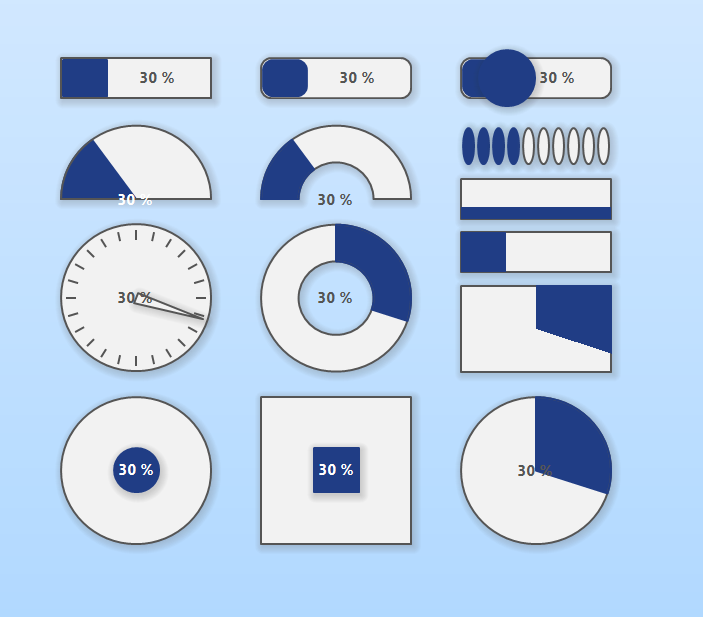
Infographic Progress Bar Types
You may also display the current value as text over the progress bar shape. There are these options:
- None - the text is not displayed
- Percentage - e.g. 90 %
- Ratio - e.g. 0.9
- Value from Maximum - e.g. 9/10
- Value - e.g. 9
For the pies, you may choose a start angle.
The custom shape may be set using drag&drop. Open Graphic sidebar, drag the desired shape and drop it over the progress bar element in the diagram.
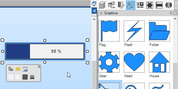
Infographic Progress Bar - Set Custom Shape using Drag & Drop
You may choose from various options on how to utilize the custom shape for progress visualization:
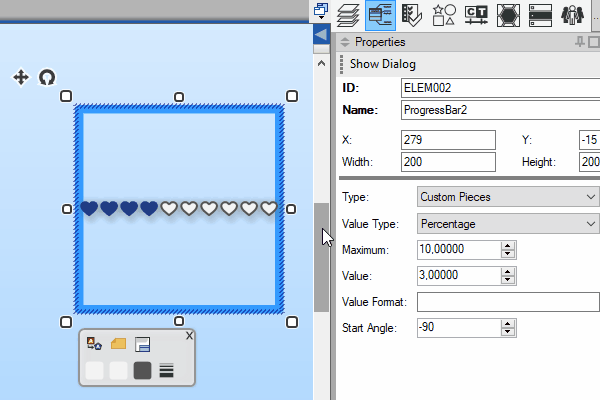
Infographic Progress Bar - Set Custom Shape Options
New Comment