Custom Diagrams
Custom diagrams are accessible from ribbon tab Process / Diagramming group / Custom Diagrams or from menu Tools/Custom Diagrams. Custom Diagrams button opens window with all custom diagrams. It's empty until you create your first custom diagram. Except for the list of custom diagrams, this window offers a toolbar with several buttons:
- Add Custom Diagram - opens Custom Diagram Editor tab which allows you to create a new diagram type.
- Edit Custom Diagram - opens a selected custom diagram in a Custom Diagram Editor and allows you to adjust its settings.
- Delete Custom Diagram - deletes a selected custom diagram after confirming the delete action.
- Refresh - refreshes the list of custom diagrams.
Custom Diagram Editor
Custom Diagram Editor allows you to create a new custom diagram and adjust an existing one. Its window consists of four tabs (Settings, Elements, Allowed Connections, Allowed Nesting) and a toolbar with a Save button.
General Tab
General tab allows you to name your diagram type. You can also set some description and choose an icon (click on Browse button and choose an image file in the file dialog) which will represent the diagram type. If you don't set any icon, the default icon will be used.
Elements Tab
Elements tab contains a list with all elements defined in the custom diagram and a toolbar which allows to manage them and to add new ones. The order of elements in the list determines the order of element tools in the toolbox (during diagram editing). The toolbar above the list offers these buttons:
- Add Element - shows Custom Element Definition dialog, which allows you to create a new diagram element.
- Edit Element - edits a selected diagram element in the shown dialog.
- Delete Element - allows you to delete a selected diagram element. This action need to be confirmed.
- Move Up - moves up a selected element in the list.
- Move Down - moves down a selected element in the list.
Allowed Connections Tab
Allowed Connections tab contains a relationship matrix which specifies which element can be connected with which one. Start elements are listed in rows and end elements are in columns. So, if you want to allow connections from element A to element B, check cell in row A, column B.
Defaultly you set allowed connections for all kind of relationships (<All> is selected in Relationship drop down). However, you can set different rules for different relationships. Choose a relationship kind from the Relationship drop down list and set allowed connections specifically for this relationship. For example, you have 'Custom Generalization' relationship and some box elements - 'Custom Class', 'Custom Note'. You can disable connections with 'Custom Generalization' between 'Custom Note' elements and allow it between 'Custom Class' elements.
If you want to enable or disable all combination of connections (for some relationship kind or for all of them), you can use button in top toolbar:
- All - enables all connections between elements for a selected relationship (or all relationships if <All> is selected)
- None - disables all connections between elements for a selected relationship (or all relationships if <All> is selected)
- Invert - inverts allowed connections between elements for a selected relationship (or all relationships if <All> is selected). Allowed connections will be disabled and disabled connections will be allowed after using this button.
Allowed Nesting Tab
Allowed Nesting tab offers matrix of containers and allowed nested elements. It allows you to specify which elements can be nested in which containers. Containers are listed in rows and all elements in columns. There is also a toolbar with three buttons, which allows you to perform batch actions:
- All - enables nesting of all elements in all containers.
- None - disables any nestings.
- Invert - inverts allowed nestings.
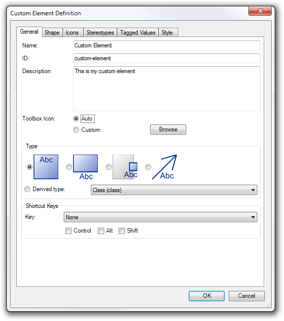
Custom Element Definition
Custom Element Definition dialog allows you to create a custom element.
General Tab
General Tab allows you to set basic characteristics of an element:
- Name - specifies the name of the element, which will be displayed also in the toolbox.
- ID - unique identifier of the element.
- Description - more detailed text describing the element.
- Toolbox Icon - an icon which will be displayed in the toolbox for the tool of the element
- Auto - a default icon
- Custom - a custom icon can be chosen using file dialog
- Type - determines the basic category of the element, the corresponding behavior and characteristics.
- Box - a standard independent element with name inside the box.
- Labeled Box - a standard independent element with name outside the box in the movable label.
- Border Element - an element which can be attached to the border of another element.
- Relationship - a relationship which can connect two elements.
- Derived Type - an element which characteristics are inherited from another existing built-in element type.
- Shortcut Keys - defines shortcut keys, which allows user to choose the element tool in the toolbox.
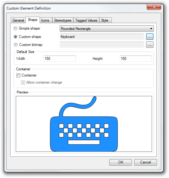
Shape Tab
Shape tab allows you to adjust appearance of a non-relationship element. You can choose from three main options:
- Simple shape - an element can take one of following shapes:
- Rectangle
- Ellipse
- Rounded Rectangle
- Diamond
- Custom shape - can be any custom vector shape which can be created using built-in Custom Graphics editor. You can choose a shape using button with ellipsis.
- Custom bitmap - can be any image. You can choose an image file using button with ellipsis.
You can set the default size of the element. The group Default Size offers two text boxes for this purpose - Width and Height.
If you want to turn on container ability of the element, check the Container check box. If you add a nested element to a container element, it can be removed from the container and add it to another one. It is possible when the option 'Allow container change' is checked (it is checked by default). If you want to disable the container changing, uncheck this option.
The bottom part of the Shape tab contains a Preview panel, where you can see the current appearance of the element.
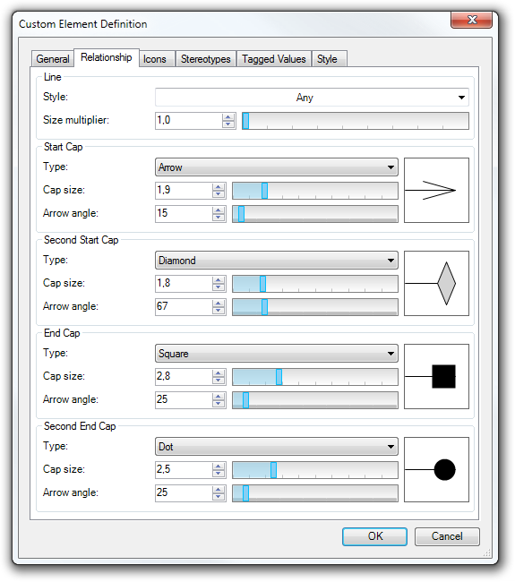
Relationship Tab
Relationship tab is displayed only for the relationships. It offers several options how to adjust the appearance of the relationship. You can set a style of the line and adjust start and end caps.
Line Group
The default style of line is Any. It means that it can be overridden by the style of a concrete element. If you choose some of other styles from the Style list, it will be not affected by style settings.
Size multiplier allows you to adjust the size of line. The default size is one - the size of line will follow the current style of an element. If you set e.g. 2, the size of the line will be double of the size set by the current style.
Cap Groups
Each end of the line can have up to two caps. Together there are 4 caps for a line - Start, Second Start, End, Second End. Defaultly type of all caps is set to None - it means that no cap is rendered on the line. You can change the type to the one of these:
- None (Default) - cap is not shown
- Arrow
- Triangle
- Filled Triangle
- Double Arrow
- Dot
- Diamond
- Filled Diamond
- Cross
- Square
- Reverse Arrow
You can adjust the appearance of each cap using these two parameters:
- Cap size
- Arrow angle
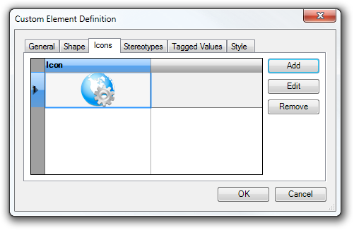
Icons Tab
Icons tab contains list with all icons added to the edited element. Icons are rendered in order defined by this list. This tab offers also three buttons, which allows you to manage the list of icons:
- Add - shows Icon Definition dialog which allows you to add a new icon.
- Edit - opens a selected icon in Icon Definition dialog, where you can adjust its parameters.
- Remove - removes a selected icon from the list.
Stereotypes Tab
Stereotypes tab allows you to manage the default set of stereotypes of a custom element. It's a set of stereotypes which will be added to an element on its creation.
Tagged Values Tab
Tagged Values tab allows you to manage the default set of tagged values of a custom element. It's a set of tagged values which will be added to an element on its creation.
Style Tab
Style tab allows you to set the default style of a custom element - border style, border color, background, fonts, etc.
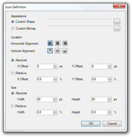
Icon Definition
Icon Definition dialog allows you to edit an element icon and its location inside the bounds of the owning element.
Appearance
Icon can be one of two types:
- Custom Shape - a vector icon, can be chosen using the button with ellipsis.
- Custom Bitmap - a bitmap icon, can be chosen using the button with ellipsis from the file dialog.
Location
The position of an icon inside the owning element can be adjusted in several ways - it can be aligned in horizontal and vertical direction and the final position can be offset absolutely or relatively (to the size of the owning element).
Size
The size of an icon can be defined as an absolute width and height or as relative size to the size of the owning element.
Usage
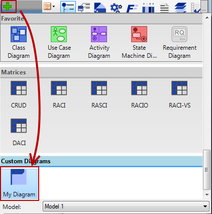
If you create and save a new type of custom diagram, you can use it in your projects in the same way as other diagram types. Click on Plus button in the Tab bar, scroll to Custom Diagrams group and click on a custom diagram you want to add to your project.
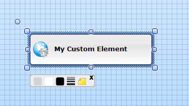
Usage of custom element tools is same as by other element tools in standard diagrams.
Sharing and Embedding to Project
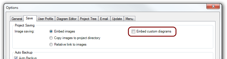
Custom diagrams are saved in {SoftwareIdeasModelerUserProfile}/CustomDiagrams folder. If you save a project with a custom diagram and you want to open it on another computer, you have to attach the custom diagram file. You can also embed the custom diagrams to the project file - you can enable saving of custom diagrams in Options (menu Tools / Options) on Save tab - check 'Embed custom diagrams' in Project Saving group.
New Comment