User Interface Diagram (Wireframing)
A User Interface Diagram is intended for desktop applications, for web applications and web sites there is another Software Ideas Modeler's diagram - Web Page Diagram.
The User Interface Diagram supports auto snapping for some elements - e.g. toolbar to window.
User Interface Diagram in Software Engineering
A user interface diagram is an important tool in software engineering. It allows you to communicate UI ideas to your customer or end-user before investing time in programming. Software Ideas Modeler offers tools that help you to create user interface designs very fast.User Interface Diagram Elements
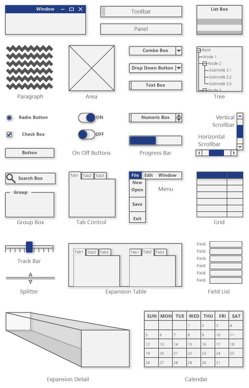
User interface diagram tools are available in the editor toolbox. The tools are used to insert the UI elements into a diagram. User interface diagram provides the following wireframing tools:
- Window
- Panel
- Toolbar
- Area
- Paragraph
- Label
- Button
- Drop Down Button
- Check Box
- On Off Button
- Radio Button
- Text Box
- Numeric Box
- Scrollbar
- List Box
- Tree
- Combo Box
- Progress Bar
- Grid
- Menu
- Tab Control
- Group Box
- Track Bar
- Field List
- Splitter
- Calendar
- Search Box
- Expansion Table
- Expansion Detail
Window
Window is a container element which can contain other elements. It represent a window of a desktop application. The element supports these settings:
- Show Minimize Button
- Show Maximize Button
- Show Close Button
- Show Size Grip
List Box
List Box represents a list component. You may hide its name and edit its items.
Paragraph
Paragraph provides a text placeholder that can take one of three different looks:
- Lorem Ipsum - generates random text which fills the whole area of the element.
- Schematic Waves
- Schematic Lines
Progress Bar
Progress Bar shows the progress of long lasting processes. The Progress Bar element supports the following progress styles:
- Block
- Continious
- Marque
It is possible to show or hide percentage and set the custom value. The default value is 50.
Scroll Bar
Scroll bars are used to adjust the view on large content which cannot be viewed in the whole within specified bounds. The orientation of Scroll Bar element is changed automatically according the longer side to vertical or horizontal.
Tab Control
Tab Control divides the form content to several logical pages - tabs. When editing the tab control you may switch between tabs using small arrow grips above the tabs. You can edit only one tab at once. The element can show content of only one tab (the active one). If you want to display the content of all tabs you should use Expansion Table element.
Expansion Table
The Expansion Table allows you to show all tabs of a tab control side by side. The tab control which will be expanded by the expansion table must be set in the Properties dialog on Expansion Table tab. Choose the tab control from the Expanded element combo box or using the Browse Button (...).
Menu
The Menu can be defined using the Properties dialog - Menu tab. It offers buttons for adding a menu/item (Add), a submenu/subitem (Add Submenu) and for removing the existing menu/item (Remove). There are also two buttons for moving the selected items up or down.
You may edit menus directly in the diagram editor. Select a menu and press F2. An edit box with the menu structure will show. The menu hierarchy is indented by dashes. The number of dashes specifies the level of a submenu/item. The selected menu/item is marked by '[X]' before its name. The separator is defined as dash symbol '-' for the item name. An example of a menu definition:
[X] File
- New
- Open
- -
- Save
- -
- Exit
Edit
Window
Help
Tree
The Tree control organizes the items in a hierarchy. The Tree element includes predefined placeholder hierarchy which you can replace with your own content. You can edit the tree in the diagram editor. The number of dashes specifies the level of an item.
An example of a tree definition:
Root
- Node 1
- Node 2
- Subnode 2.1
- Subnode 2.2
- Subnode 2.3
- Node 3
- Subnode 3.1
- Subnode 3.2
- Subnode 3.3
Field List
The Field List contains a list of general fields in the default configuration. It is possible to change the list to specific fields which will be defined by class attributes. The classifier can be set using Properties dialog on the Field List tab by choosing a classifier in the Classifer box.
Expansion Detail
The Expansion Detail is a connector which connect a collapsed (or concise) element with a expanded (or detailed) element.
Grid
The Grid represent a table. You can define headers of columns and rows and if you want also the values to cells. The grid contains empty columns and rows in the default configuration.
User Interface Diagram Examples
User Interface Diagram Tool
You can download our user interface diagram tool with the following button and start to design your user interface diagrams right now:
New Comment